Adult Coloring Books Red Flags
Coloring Book Red Flags - What I Look for and Why it Matters

We live in a world of AI now and even before this became a thing, there were literally millions of adult coloring books in the world for you to choose from. Overwhelming much?
A quick search on Amazon (the australian site) yields over 70,000 search results for the phrase 'adult coloring book' and over 48 pages of books to sift through and if you're like me, that's just too much sifting and not enough coloring!
So here is a quick list of things that I like in my coloring book that might help you, coupled with some examples of my favourite books and why. Note that this blog isn't about the content of the book - color whatever pictures you like! But I can help you navigate a few important points!
It's also worth noting that these are my opinions and my opinions only. I have not been paid to endorse the coloring books I've recommended in this blog and completely understand that everyone is entitled to their own opinion. (so don't come at me!)
(This blog contains affiliate links and I may earn a small commission if you click them or purchase items from Amazon - at no cost to you - so go ahead!)
1. Consistent Line Size
When it comes to adult coloring books, consistency in the thickness of the lines provide a really satisfying symmetry. Consistent line work helps me decide how to color a page also because the thicker the lines are, the better they will handle markers while thinner lines tends to lead me towards pencil work.
Thicker lines capture bleed from markers well and this means you don't have to be quite so careful! Thinner line art is fine also but they do require more careful coloring no matter the medium.
 |
| See how the lines here are an inconsistent thickness? This is unpleasing to the eye and turns me off, even before I've decided what medium to use. |
 |
| These lines are all the same thickness which is really satisfying to me and definitely more appealing as an art project. This is a Hanna Karlzon Book and you can browse her collection HERE |
The Takeaway:
If you're in the mood for some scribbling - choose a book with consistently thick lines!
2. Challenging - But Not Busy!
I love a coloring book with illustrations that are detailed enough to absorb my focus. I want to float away on my work, mindful of my process and the color choices I'm making. There is a tipping point however, where a challenging image can become confusing, too detailed or intimidating and knowing where that line is for you is can be really important.
When choosing coloring books and pages, make a beeline for anything that sparks your wonder, even if it feels a little scary and stay away from anything that gives you an overwhelming feeling when you see it. Coloring should be a soothing, creative practice so learning the difference between 'busy good' and 'busy bad' is something that will help you stay in your creative flow!
 |
| This picture fills me with chaos and overwhelm. The inconsistent line art and the lack of symmetry just doesn't appeal |
 |
| I love the consistency, symmetry and cleanness of this image, which is why I colored it during a mindfulness meditation. This image is from Sarah Renae Clarks' Kalaedo mania and you can browse her collection HERE. |
The Takeaway:
Coloring Books and pages should feel wonderous and like an adventure so choose images that challenge you, not intimidate you.
3. I Got a Black Space Baby ...
The whole point of a coloring book is ... well, coloring in! So books that have large amounts of black space is pretty much a no go for me. While some black spaces can help to create depth and intricate black shading can really help with shadows and highlighting; you don't want to spend money on a book that you can't color half of!
 |
| Rory Dobner's Ink House is a brilliant example of black space being used well. |
 |
| The black (or dark blue) ink adds to the story and the depth of the page making it fun and challenging to color. Get The Ink House HERE. |
 |
| This coloring page is over half blacked out, leaving not a lot of coloring to be done! Something to avoid if you want more coloring for your dollar. |
The Takeaway:
Coloring books are for coloring so swathes of black space is something I try to avoid.
4. Quality Paper Mama...
If you want to do your best work, choosing coloring books with great paper is a must. I don't avoid kindle printed coloring books by any means but it's important to know that inferior paper is a consideration for the type of coloring you'd like to do.
The thicker, better quality paper allows for more layers of color. When you can layer more color, you give yourself more options for highlights, shading and color blending. I have been known to prize quality paper over illustration choice for my work, choosing books where I'm not in love with the line art, simply because the paper is of such high quality; that's how important paper is to me!
 |
| Alexandra Franzese's amazing books are printed on kindle paper but this doesn't stop me buying them! Paper is something to consider when choosing your mediums but its not a dealbreaker. Browse Alexandra's incredible range HERE. |
 |
| On the other hand, Johanna Basford's books are printed independently and then sold on Amazon. The paper is thick and creamy, making it a pleasure to use for both pencil and marker artists. Browse Johanna's range HERE. |
Now if you're someone who likes to buy printable coloring pages, you get to choose the paper you decide to print on but us die hard book lovers have to choose carefully.
The Take Away:
You dont have to color on great paper to get great results but it definitely makes a difference!
5. Greyscale Away
Some coloring books are what is called greyscaled and coloring these can give you real depth and artistic confidence but some poorly made greyscale goes too far and can leave you feeling underwhelmed. The other issue with some greyscale is simply that they are stolen. Photographs or artist prints, edited to be grey and white and then re sold as coloring pages. I run for the hills when I see stuff like this.
 |
a stolen image, edited to be black and white and then sold as a coloring page. Coloring this much grey will leave your colors muddy and create a result you're probably not going to be happy with.  |
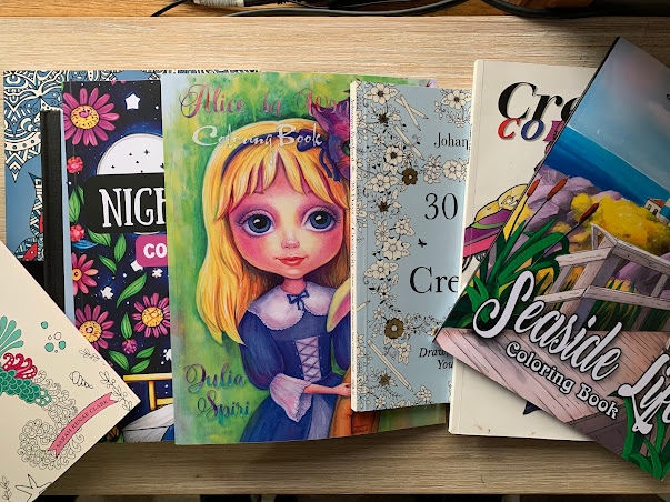
But don't avoid greyscale altogether; there are some brilliant artists out there creating greyscale books and pages that are an absolute pleasure to color in. Julia Spiri's Alice in Wonderland interpretation is one of my favourite greyscale books available. Browse her gorgeous work HERE.
So there you go, five things to look out for when you're buying your coloring books. Did i miss anything? What are your Coloring Book Red flags? Please share below and feel free to follow for more blogs about all things coloring!

Comments
Post a Comment